
Neil Dunne - Artist Interview
Neil Dunne is an artist and part-time print lecturer living and working in Dublin. Having originally studied Fine Art/Printmaking and Art History at the National College of Art and Design, Neil received the NCAD postgraduate scholarship and completed an MFA in 2017. He specialises in screen-printing but also produces paintings and installations, with his work being exhibited throughout Ireland and internationally.

Neil Dunne. Photo credit: Ryall
How did you get started?
I guess getting into art was a natural progression for me, being creative has always been a mindset for me but my ‘understanding’ of a creative process began once I started in NCAD. College really contextualised a lot of creative thinking for me and introduced me to similar minded people which helped me progress massively.
Fast forward nearly a decade I still feel as if I am in that mindset of discovery and progression. There Is always something new to play around with, some new place I haven’t seen or some emotion that has just raised its head.
In 2013 you were awarded the Mary Crawley Travel Bursary and spent the summer in NYC where you worked with printmakers Dieu Donné. What was that experience like?
I loved New York! It was the first time I was away from home for a long time and also living alone, it was some experience. Dieu Donné is a beautiful gallery/studio specialising in hand made paper editions. Interestingly they used the silk-screen process heavily while I was an intern there, so I got to explore a couple of silk-screen studios as well and help with some really amazing projects. At the time they were based in central Manhattan but have since moved to Brooklyn to a larger space.
Chris Saucedo, an artist who at the time was commissioned to make these large scale interpretations of the twin towers, was my first big undertaking there. I was lucky enough to be the only intern at the studio at that particular time so I got a very hand on experience and got to meet some amazing artists like Do Ho Suh and Mel Edwards.

‘Mare’, 4 colour hand-pulled screen-print. Photo credit: Damn Fine Prints
Over the span of 4 months I really got to grips with the intricacies of papermaking within a fine art context, the master paper makers, Paul Wong and Amy Jacobs, could develop particular types of papers for all ranges of artistic practices and they had limitless knowledge on the subject.
Can you take us through your artistic process?
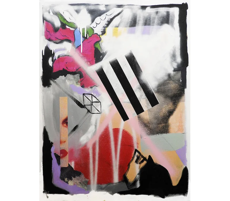
It’s a little all over the place, to be quite honest. I try and keep to a structure as much as possible - it normally starts out with a very loose sketch on canvas detailing forms and suggestive shapes - adding layer upon layer of paint and colour until I get a background I am happy with. These added layers normally consist of silkscreen images, enamel and acrylic and give a dense under painting with hints of the layer below. I normally go through a process of ‘whiting out’ or removing certain layers and then finally reach a level where I am happy to finish. This process can span a couple of months or maybe just a few days.
Recently I’ve been back working on large-scale paintings - something I really love to do – they’re heavily influenced by the materiality of paint and the image elements of silkscreen. Urban influence is massive in my work, I love to bounce the two processes off each other with that in mind, they inform and conflict some of my ideas of art. Materiality is also something that is quite difficult to achieve in silkscreen, so it adds that other dimensionality to that element.
‘Untitled Composition’, Silkscreen on paper, silkscreen ink, acrylic, spray paint and paper on canvas. Photo credit: SO Fine Art Editions
As I deviate between Silk-Screen and painting, the two processes cross paths heavily. Sometimes a painting will start out based around some studies I have made and then a silkscreen image will overtake the original work. This idea of ‘whiting out and ‘blocking out’ reoccurs quite regularly and results in great perceived depth on canvas. A sense of conflict also festers from this through one image or forms trying to out do another.
I think it stems from a belief that there should be some technical proficiency to the way in which I make work, followed by complete denial and then ending up with a painting. It’s a funny way to work and certainly means I have an obscure timeline on the completion of pieces. They are in their very essence collages of ideas formulated and then dismantled, painted over and reimagined and then ultimately completed.

‘One and a half horses’,Screen print, edition of 12, 45 x 64 cm. Photo credit: SO Fine Art Editions
The notion of ‘Identity’ expressed in your work is explored through commentary on your personal experiences and your urban environment. Can you elaborate on this?
Identity is key to individuality in expression; I believe this is one of the keys to making interesting art. It explores ideas of oneself and a personal understanding of the world – at least for my own practice. Personal experience is a starting point for some of my work; elements of places where I grew up, phrases and ideologies play a big part in my initial research.
Having studied Art History, does your education background influence your research and work?
I referenced a lot of classical works in some of my earlier work, it’s still present in some respects but is largely abstracted in newer pieces. The compositional arrangement of characters and their overall subject matter was something that really interested me when I was studying in NCAD. I loved pulling apart the images and reimagining them.
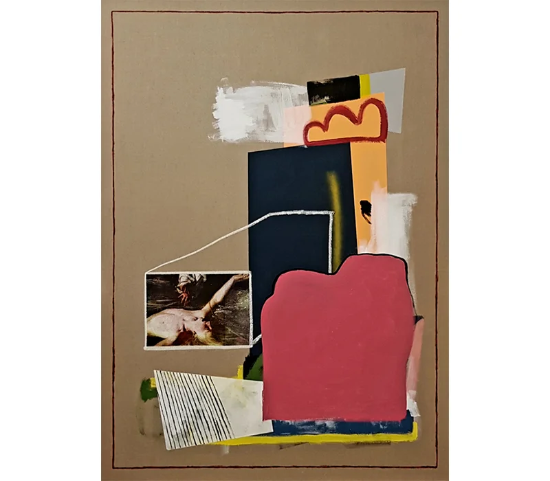
'Gemino', Silkscreen and acrylic polymer on canvas, 100 x 140 cm. Photo credit: SO Fine Art Editions

'Ingemino', Silkscreen and acrylic polymer on canvas, 100 x 140 cm. Photo credit: SO Fine Art Editions
What was your thinking behind ‘Icon Study’?
The Icon series was the result of my graduate show in 2014 at NCAD. The imagery took a look at secondary characters and landscapes in renaissance art, I really tried to put an emphasis on emotion in those works. A lot of the characters were originally positioned in very dramatic poses, normally with a look of longing or sadness. I spent a lot of time researching these particular characters and made quite a few character studies that never really seen the light of day, resulting in 4 large scale works and a huge piece that couldn’t be shown due to health and safety.

A view of Icon Study Series, NCAD Graduate Show. Photo credit: Irish Arts Review
I wanted the layout of the show to be quite imposing on the audience, so each of the works created was free standing and took up a large portion of the room it changes the dynamic of audience interaction. It’s something that has stuck with me over the last couple of years, I really try and remove the standard to bring something a little different to the table.
What do you want viewers to take away from your work?
That’s an interesting one, sometimes I want the audience to look at some of the pieces with complete bemusement, and some of the works can certainly come across as odd. Other times a political motive is beneath, more recently I’ve been exploring the use of text to guide some ideologies through some new works I have created. Colloquial terms stemming from very specific places and that also have very specific meanings create new meanings around some of my works.
I think it can be quite important for the audience to have a relationship with the imagery and style of a work. It brings a new dimensionality of understanding and presence to each piece.

‘Everything and Nothing’, Silkscreen, gesso, oil crayon & acrylic polymer on linen, 160 x 190 cm. Photo credit: SO Fine Art Editions
What other techniques do you use?
I am at an interesting time I think as I have started to branch out into some 3D work, its very early stages yet but I have some plans for work that will sit alongside and compliment my 2D pieces. I mainly stick to Silk-screen and paint though. Drawing is heavily used in the research phase but very rarely reaches exhibition.

‘Fallen Stone’, Neil Dunne, Mixed media. Photo credit: Pallas Projects
How do you challenge yourself artistically?
I set a high standard for my finished work. It can be quite difficult at times but I am learning to not put a timeline on completion. I think my work needs to exist for a certain amount of time in my studio before it can reach its ideal level of completion and even then I’m skeptical if it’s done. It’s nice to have curators and gallerists over to throw some opinions into the mix; it’s a process I enjoy.
What are your plans for the Future?
I’ve taken a conscience decision to spend a lot of time in the studio this year; I really want to build up a huge body of work I am happy with. I am looking towards a couple of group show throughout 2019 and a big debut solo show in early 2020.

‘Funfair Casino’, Hahnemuhle print, 39.6 x 60 cm. Photo credit: Hens Teeth
To see more of Neil Dunne’s work visit: neildavidjames.com · @neildavidjames